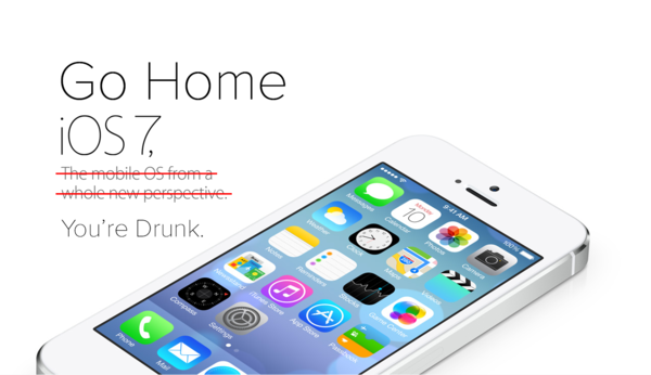
Go Home iOS 7, You’re Drunk.
When the clip rolled and Jony Ive’s face emerged, every pair of eyes were glued to the screen in high hopes of innovation.
Shhh, Jony is preaching. #wwdc
— Jared Erondu (@erondu) June 10, 2013
Then we saw it. “The biggest thing to happen to iPhone since iPhone.” And they weren’t kidding. iOS 7 brought the biggest redesign to iPhone since, well, ever. Not a pixel was left untouched.
The world then took to the social networks and blogs, myself included, to nitpick the pixels, the app icons, the frost effects, the font weights, the inconsistencies, the colors, the… wait I’m doing it again.
Summary of iOS7- Better UX- UI is conflicting. Pretty in some places, WTF in others- Color overload@dribbble will come alive tonight.
— Jared Erondu (@erondu) June 10, 2013
Drunk #
But after updating to the OS for myself, playing around with it, and comparing it to its iOS 6 counterpart, I’ve come to conclusion that iOS 7 is simply drunk.
Let me explain.
- Being drunk lowers inhibitions – Apple has many of them. One is not giving into design fads and trends, but rather creating them. In iOS 7, that was broken. Gestures were added, chrome was significantly reduced, the back button became the back arrow (sorta), fonts became super thin, gloss was removed, and “flat” was introduced. Which are all okay when properly executed.
- Being drunk affects motor functions – Execution was subpar. There were numerous design inconsistencies which showed the lack of cohesiveness in the first portion of the redesign process. And ego, naturally.
- Being drunk slurs speech – Or in this case, pixels. The back arrows weren’t centered to the text, the control center on the lock screen confuses you as to which way to “slide to unlock,” etc.
- Being drunk makes genius sound silly – you know when your wasted friend starts with “what if” and you’re like this? But if they relayed that same idea to you 24 hours later, it’d be pure genius? And that’s because we tend to focus on words, not context. Apple obviously knows where they want to take iOS, but had a hard time expressing themselves in the first beta. Focus on the vision, not the pixels.
- You can still think – despite the controversial UI, Apple did innovate well on the UX. Lots of needed things were added/changed/removed (new finder, control center, improved notification center & multitasking).
But let’s focus on #1. Apple came out of their shell. Apple came out of their shell (twice for emphasis). And that’s a good thing.
The company is filled to the brim with exceptional talent. There’s no question that the people behind these devices and OS’ are some of the smartest individuals on the planet, but talent doesn’t benefit you without a proper execution plan. Which leads to my second point.
Sobering Up #
The best part of watching a friend who was totally wasted last night sober up is when you hear them say “what was I thinking?”
What Apple shipped Monday is simply the first of many releases to come and the start of a more consistent design. They’re in their drunk exploration phase when genius sounds silly, pixels are slurred, and inhibitions are low. It could be that they wanted to test a few theories in the wild first and monitor reactions, or maybe they simply ran out of time. It’s not easy redesigning an OS from the ground up in 8 months.
Regardless, we can expect lots of things to change between now and Fall when Tim Cook takes the stage to release the GM iOS 7. In the meantime, our tweets, articles, and unsolicited redesigns will serve as AA meetings.
A more refined and sober iOS 7 is coming. Just have patience.
