Jared Erondu

Building Playbook; advising @ Greylock Partners • Previously CD @ Teespring; early design @ Omada Health, Treehousee

Read this first

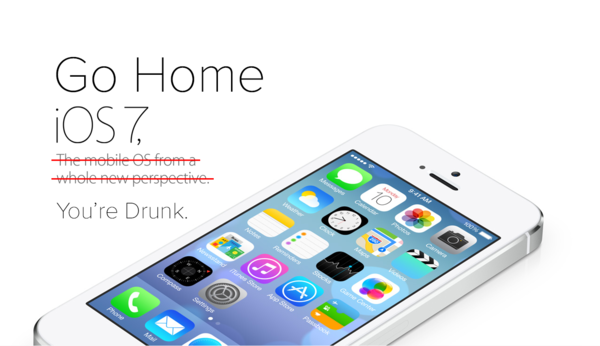
Go Home iOS 7, You’re Drunk.

go-home.png

When the clip rolled and Jony Ive’s face emerged, every pair of eyes were glued to the screen in high hopes of innovation.

Then we saw it. “The biggest thing to happen to iPhone since iPhone.” And they weren’t kidding. iOS 7 brought the biggest redesign to iPhone since, well, ever. Not a pixel was left untouched.

The world then took to the social networks and blogs, myself included, to nitpick the pixels, the app icons, the frost effects, the font weights, the inconsistencies, the colors, the… wait I’m doing it again.

Drunk

But after updating to the OS for myself, playing around with it, and comparing it to its iOS 6 counterpart, I’ve...

Continue reading →


We’re the [blank] for [blank]

“We’re the Twitter for this and the Facebook for that.”

we-are-blank.png

When I read something like this, here is how I break it down. The first blank is the company you feel you relate to most, and the second is the niche you wish to understand. But the overall sentence? Just a vague description. Open to multiple interpretations… which is bad.

When time is short…

Don’t get me wrong. When you’re trying to pitch something or help someone quickly understand your product, yes it’s nice to give some context. Something people can quickly connect with and understand.

But that’s great for when you only have a brief moment.

When you own the clock…

But when communicating via text (your product website, email, etc.), using an existing product or company isn’t always the best route. After all, if you latch on to someone else’s product and reputation, you’re automatically limiting yourself to what they’ve...

Continue reading →


Don’t Mislead Your Users

Have you ever tapped an icon or used a gesture only to end up in the wrong place? You were mislead. It’s a sucky feeling. It’s also why we designers should be specific in our intent.

Design is rapidly evolving and trends are appearing all the time. Right now, our interfaces are leaning more towards iconography and gestures rather than text. Which is awesome, and more concise. But with them is a greater chance to mislead. You see, it’s hard to mislead your user with words because they’re words–the explicit and original way to communicate (unless, of course, you skipped English class). But there’s no popover hovering above our icons and gestures. We’re assuming that our users will deduce their meaning and in some cases, discover them.

We shape our products based on what we envision, but sometimes, those visions can be blurry in some areas. Then four hours after our product has gone into...

Continue reading →


Brevity in Design

Many articles have been written on the benefits in store for designers who write. I can testify that they’re endless. Over time, the line that separates writing from speaking, coding and design gradually fades away. Eventually, you realize that they’re simply different forms of communication.

When you execute any of these four actions, you’re conveying a message. A good writer, speaker, hacker, or designer is measured by how well they’re able to convey this message. There are many rulers that could be used for this measurement.

  1. Quality: No grammatical errors? Good powerpoint? Clean code? Solid UI/UX?
  2. Value: Worth writing? Worth saying? What value does it bring to the code? What value does it bring to the interface?
  3. Sustainability: How long will the article be applicable? How long will the speech carry weight? Is the code future-proof? Is the design future-proof?

and Brevity

In...

Continue reading →


Typography in Product Design

Today, my lesson on the importance of typography in product design went live on Hack Design.

A few weeks ago we were introduced to the art of type, and gained a basic understanding of the rules surrounding it. But where does it all fit in? Of what value is typography to the interfaces we interact with on a regular basis?

We put extreme emphasis into the code and pixels pertaining to our products. But both are rendered useless without the content. And as the esteemed Robert Bringhurst once wrote, “typography exists to honor content.” In this lesson we’ll learn where typography and product design cross paths, and how to properly implement it into our designs. We’ll learn why it matters most.

It was fun curating what I thought to be the best 6 links for introducing one to the art of type, and its implementation. Go take a look!


I’m on Twitter.

Continue reading →


If Emails Worked Like URLs…

…there would be less triaging involved.

Over the weekend, I received a few emails for possible design work. Immediately, I applied my red Gmail label.

Screen Shot 2013-02-05 at 9.01.41 PM.png

But then I thought, what if emails worked like URLs? As you’ve probably read elsewhere, I’m currently working on an email application for the iPad. It’s called Evomail and with it, we plan to tackle email volume, management, and action times.

The management part is where triaging comes in. We do it every morning when we roll out of bed, grab our smartphones, and start sifting through the overnight delivery. Archiving here, deleting there, and most importantly smacking on labels for when we hop on the desktop.

These labels act as subfolders to our inboxes. But what if our email addresses could access these folders too? Then they’d resemble URLs. And that’d be a good thing.

Let me explain

Take the average freelancer for example...

Continue reading →


Go Out and Do Nothing

A few weeks ago, I wrote on a lesson I had learned from designing Evomail. Today I’m going to expand on another.

Lesson 2: Go out and do nothing

Late September 2012, I had began designing a certain interaction for Evomail. I did my raw sketches on the Paper app for iPad, then finalized with pen and paper in my Moleskine. The look and feel wasn’t ideal, but it was a decent start. I waited a day (always good to flush out areas), then hopped in Photoshop with high hopes of conquering the design within a few hours.

Didn’t happen that way

I ended up spending day after day shifting, scrapping, and re-sketching. It became a cycle. “It just isn’t happening for me,” I thought. Had I seriously been conquered by 2-squared inches of an intangible interface? Jon and Dave (co-founders) were scratching their heads at the delay. After all, turnaround time was pretty quick everywhere else. What was...

Continue reading →


You Are Your Number One User

For the last few months, we’ve been hard at work on Evomail. It’s a modern email client for the iPad that will hopefully find its way to your tablet’s dock in the coming weeks.

The time I’ve spent designing the overall look and feel of Evomail has truly been educational. I’ve sharpened some skills and have learned a few lessons.

Lesson 1: I am my number one user

Funny enough, after we began work on Evomail, news of other iOS based email clients began popping up like weeds. Each aiming to solve something different. Each trying something new. And everytime I would read an article on TechCrunch, or view a shot on Dribbble, I would open up Evomail and just take a long look. “Will this work?” I’d ask myself. “Will it be a viable solution for our target market?” No thoughts of doubt, just questions of execution and audience reception.

I’d then hop in Photoshop and start touching things...

Continue reading →


Wunderlist 2 looks great

6Wunderkinder has just released the long awaited Wunderlist 2 for just about every device. I’ve been using it for a couple months now and it’s pretty amazing. The team at 6W, lead by Christian Reber, have executed well in terms of design and vision for the product.

It comes down to the applications’ simplicity. Often times we mistaken a slew of features for a more powerful effective app/experience. Yet sometimes it’s those same long lists of features that end up making the app hard to grasp, or in some cases ultimately useless.

We need to stop thinking about simplicity as solely an art direction. It can be a product direction. Focus only on what you want your product to be great at. Add some finesse. Everything else is noise.

After axing Wunderkit earlier this year, it’s nice to see them back in the game with fully native apps this time. We’ve reviewed the v2 on The Industry and I...

Continue reading →


Mailbox app: Rethinking labels

I don’t work for Mailbox. I don’t know anyone at Mailbox. In fact, I’m working on an email app for iOS of my own.

But today, the media shed some light on what the people behind Orchestra are working on. It’s pretty cool. But there was one section that caught my eye in TechCrunch’s coverage:

If there’s one feature that’s missing, especially for advanced Gmail users, it’s probably the ability to label emails into different categories.

When I read that line, I didn’t think “what? No label support?” Rather, I realized that the Mailbox team are truly out to do something different. You see, you can’t fix a problem, beat a company, or even move an idea forward by simply duplicating and reskinning what already exists.

Take Facebook for example. It is the social network. With over 1,000,000,000 users (typed it out for the dramatic effect), it’s safe to say they did something right. But there...

Continue reading →